THE ERA OF THE 8-SECOND BRAND IMPRESSION
6 min read
Someone clicks on your profile. They have never heard of you. In the next eight seconds, they will decide whether you are worth their time or not.

They will not read your bio carefully. They will not scroll through your last 12 posts. They will glance at the grid, register a feeling, and either follow or leave.

The average social media user spends 8.25 seconds on a post before scrolling. For a profile visit, the window is even shorter. You are not losing people to bad content. You are losing them to a first impression that does not land.

Here is what is actually happening in those seconds, and what to do about it.
1. PEOPLE ARE NOT READING YOUR PROFILE, THEY ARE PATTERN MATCHING IT
The brain does not process a new profile the way it reads a document. It scans for patterns: colours, shapes, tone, consistency. Within seconds it has already decided whether this looks like something worth staying for.

This happens before the person knows they are making it. The grid aesthetic, the typography, the colour palette, the bio tone: all of it arrives as a single impression before a single word is read.

Profiles with cohesive visual identities see 38% higher engagement rates and up to 20% better conversion rates. That gap is not about content quality. It is about whether the brain registers the brand as credible or chaotic in the first glance.
Try this;
Open your Instagram profile on a phone you have never used and look at it for three seconds. What feeling does it give you before you read anything? That is your first impression.Check whether your last nine posts share a coherent visual language. If they look like they came from three different brands, your pattern is broken.Ask someone unfamiliar with your brand to describe it in three words after five seconds on your grid. If their answer does not match what you want to communicate, you have found the gap.
example;
Aesop posts in deliberate groups of three, creating a visual rhythm the brain reads as a single design feature. Amber glass, clean typography, no models, no noise. A new visitor knows within two seconds who this brand is for. That legibility built a $2.5 billion brand without a single traditional ad.THE TAKEAWAY;
People do not read your profile. They feel it. Make sure the feeling is the right one.
2. THE PROBLEM IS NOT SHORT ATTENTION SPANS, IT IS HIGH STANDARDS FOR WHAT EARNS THEM
People will watch a 20-minute video, read a long caption, save a dense carousel. The drop-off happens before the content even starts. It happens in the glance, the scroll-past, the profile visit that ends in two seconds without a follow.

The brands losing people in those first seconds are not losing them to bad content. They are losing them to a profile that does not communicate its value fast enough. An unclear bio. A grid that looks like every other brand in the category.
Try this;
Rewrite your bio to answer one question: what will someone get from following you that they cannot get anywhere else? Put that answer in the first line.Look at the top three accounts in your category. If your profile is interchangeable with theirs, you are not giving a new visitor a reason to choose you.Pin your three most representative posts at the top. They are the first thing most visitors actually engage with. Make them earn the follow.
example;
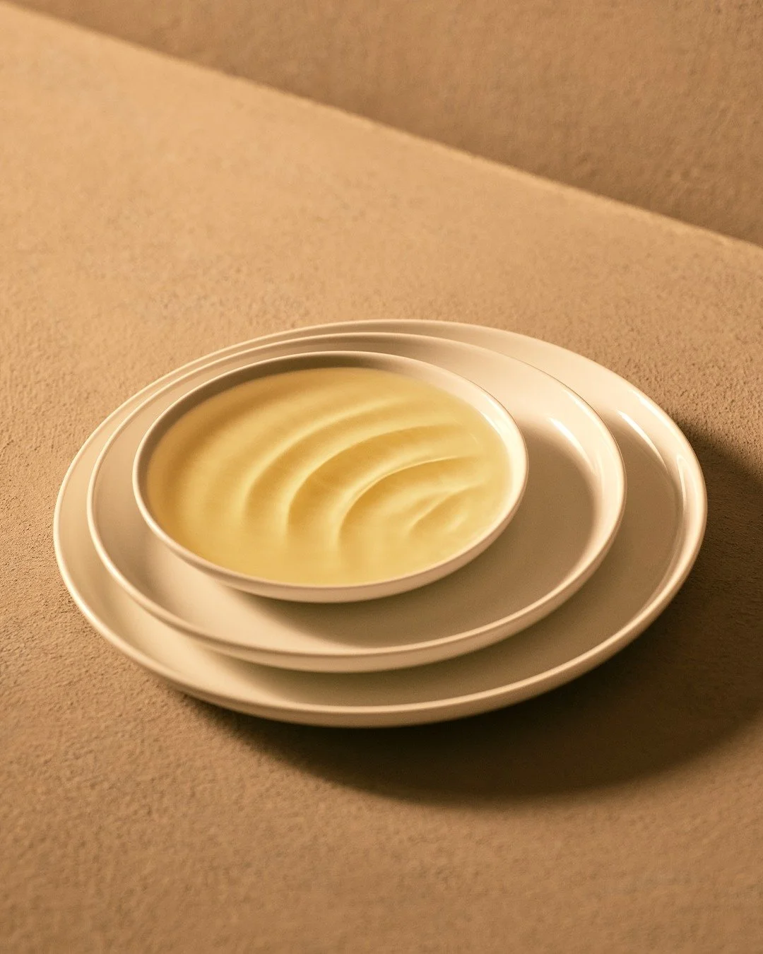
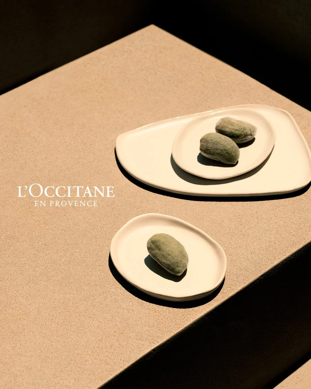
L'Occitane's bio reads: "Crafting life ties since 1976. Welcome to Haute-Provence." That is the entire positioning in one line. The profile delivers the same message visually: lavender fields, sun-bleached textures, Provençal warmth. A new visitor does not need to scroll to understand who this is for. The brand grew net sales to €2.8 billion in 2025 on the strength of that clarity.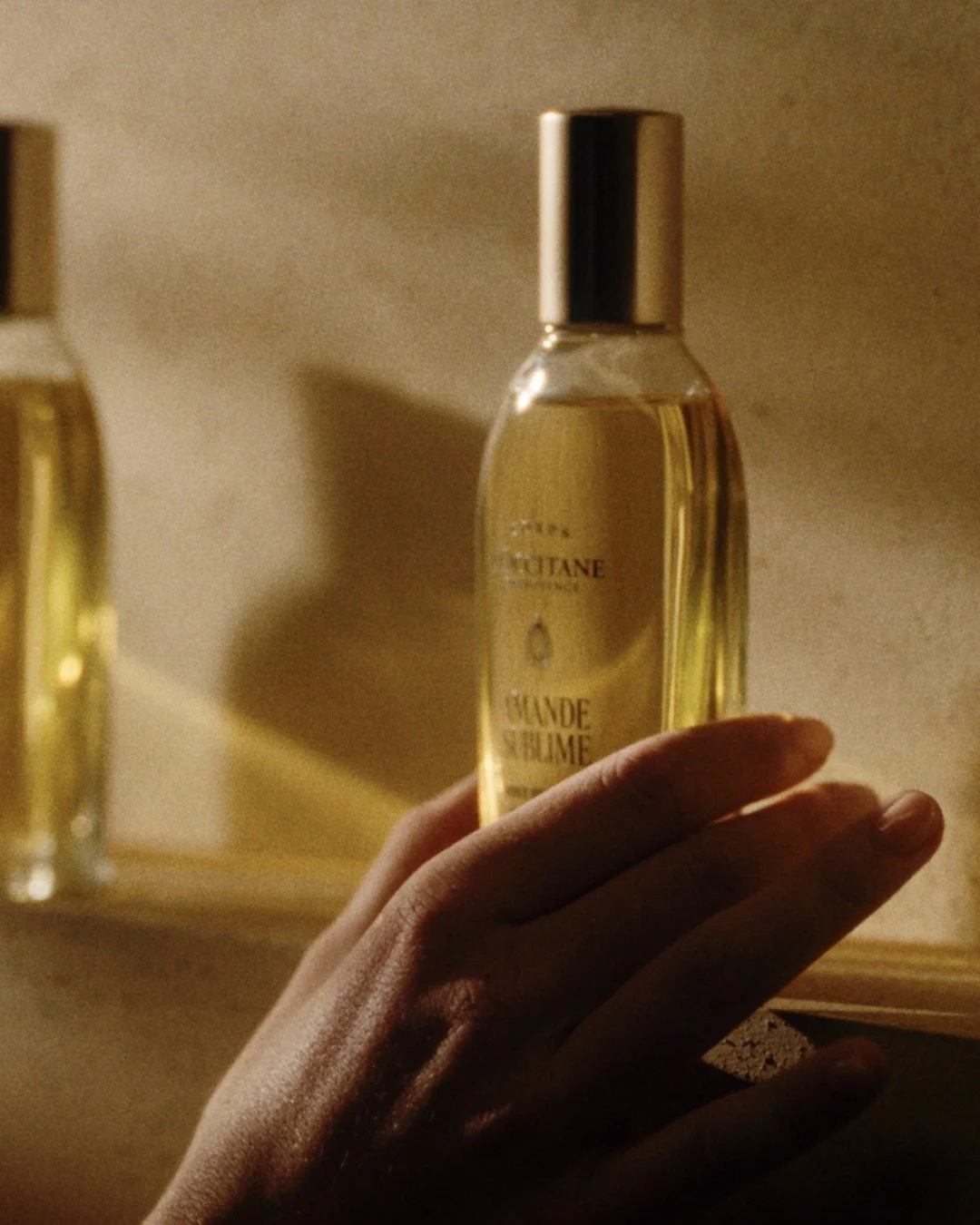

THE TAKEAWAY;
People are not ignoring your brand because they are distracted. They are ignoring it because it has not given them a fast enough reason to pay attention.
3. CONSISTENCY IS NOT A DESIGN CHOICE, IT IS A TRUST SIGNAL
When a profile looks consistent, the brain reads it as reliable. When it looks inconsistent, it reads as unreliable, even if the product is excellent.

A grid that shifts between three visual styles, a bio that does not match the content, captions that alternate between polished and casual: these all send the same signal. This brand does not know what it is. And a brand that does not know what it is cannot be trusted to deliver what it promises.
try this;
Define three non-negotiables for your visual identity: a colour palette, a recurring content format, and a tone for every caption. Write them down somewhere your whole team can access.Before posting, ask one question: does this look and sound like us? If you have to think about it, it probably does not.Audit your last 30 days for consistency of voice, not just visuals. Tone shifts are often more disorienting to a new visitor than visual ones.
example;
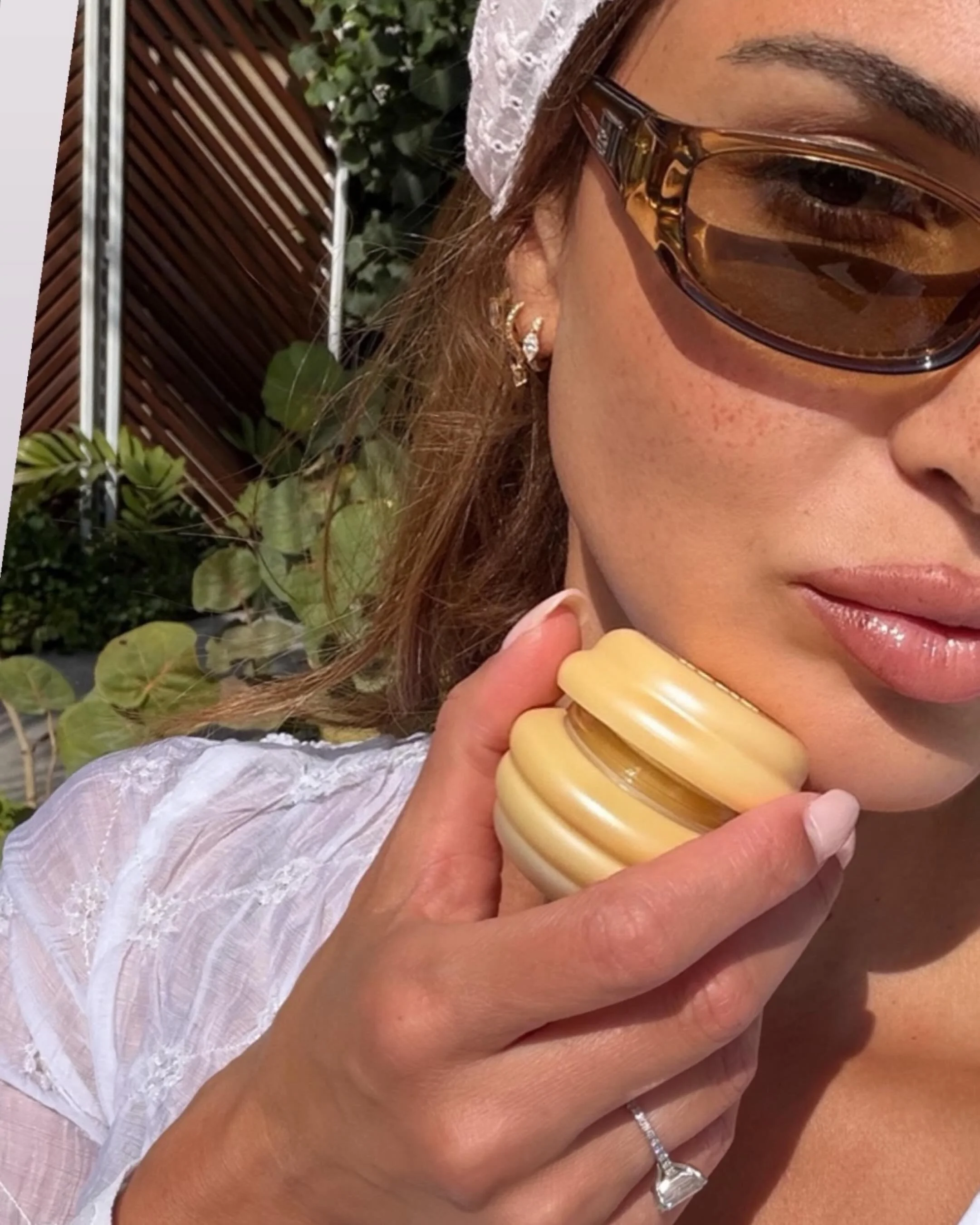
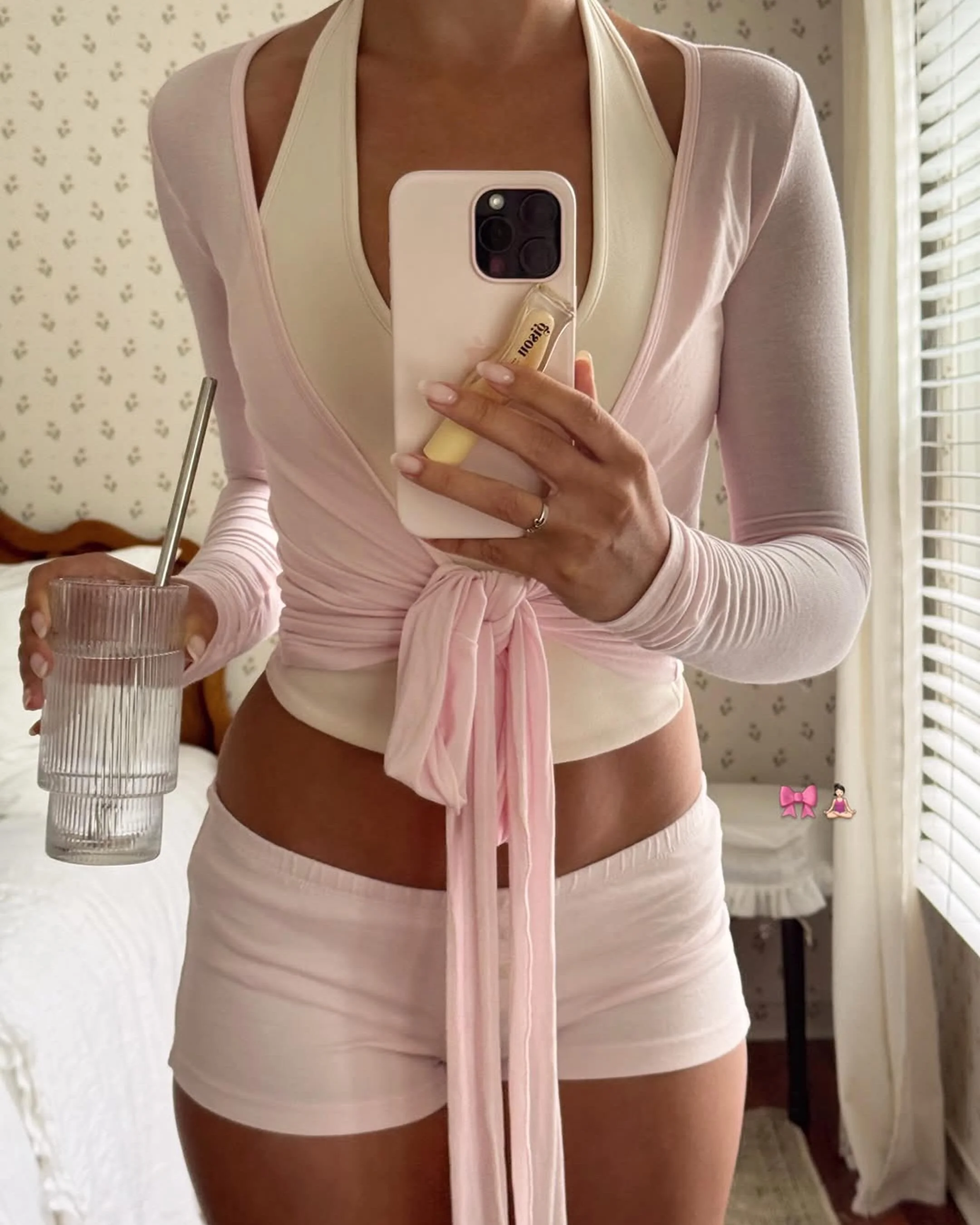
Gisou's profile has one unmistakable visual language: golden honey tones, beehives, warm editorial lighting. Every launch adapts creatively, but the visual DNA never changes. That consistency built cult status for the Honey Infused Hair Oil and earned organic endorsements from Bella Hadid and Rosie Huntington-Whiteley before the brand ever paid for them.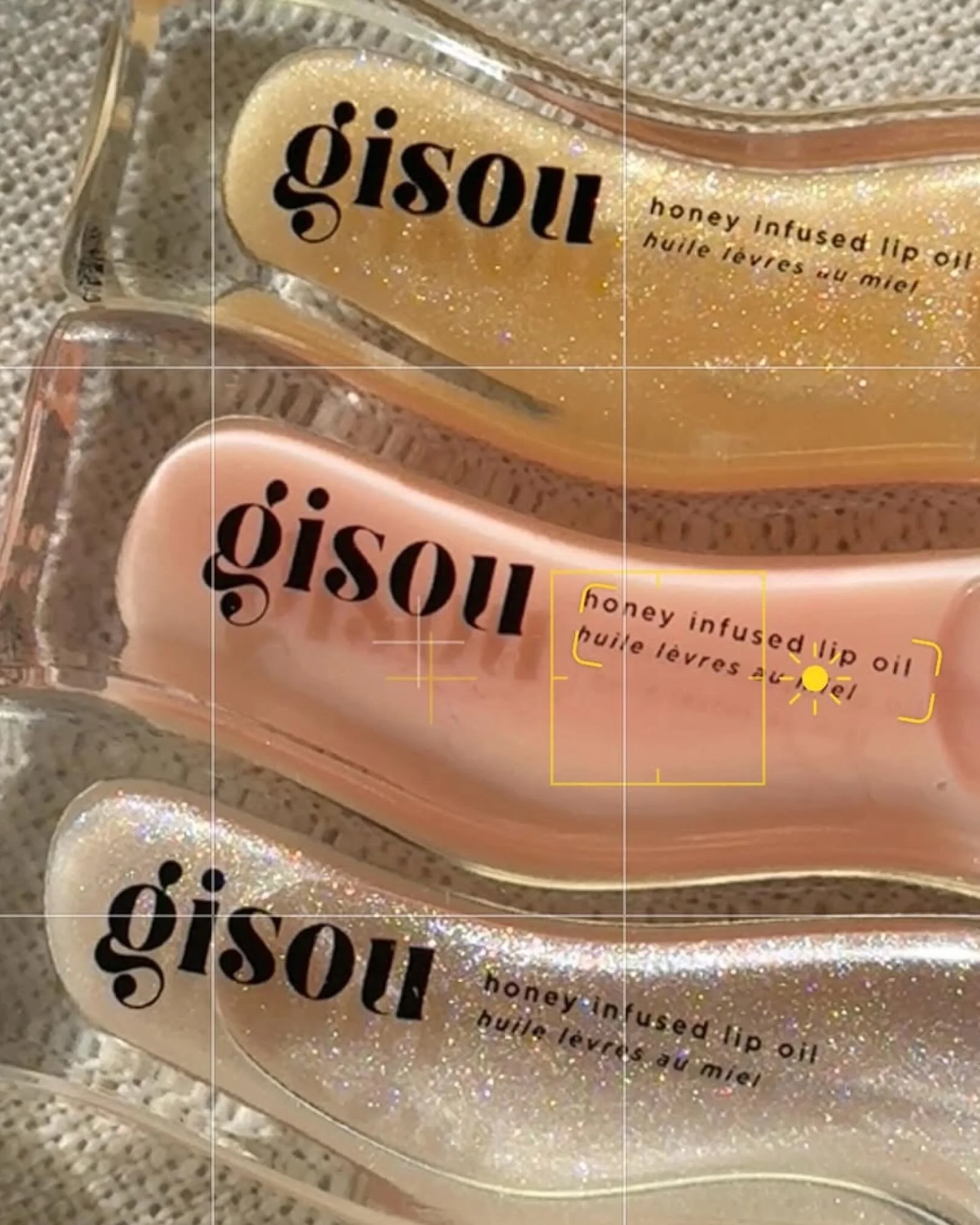
THE TAKEAWAY;
Consistency tells people your brand can be trusted before they have read a word or bought a thing.Eight seconds is not a limitation. It is a design brief.
The brands that win the first impression are not the ones with the best content hidden three scrolls down. They are the ones who understood that before anyone reads, watches, or buys, they feel.
Your profile is not a portfolio. It is a first impression that either earns the next step or ends the relationship before it starts.
If yours is not working as hard as it should, we are here to help you fix it.